Friday 18 May 2007

Pushing forward

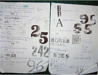
Don't know what happened today, my brain just decided to switch off! Been going in every day for nearly two weeks from 10.30 and not getting in till around 9pm. Not half as much done today as i would have liked but I think my body's telling me I needs a break. Only 2 weeks to go now, but hopefully not coming in on Saturday will give me the change of pace I need, change is as good as a rest afterall. Plan to send off my logo to Bookbinder's of London to make an embossing punch and work out all the facts for the rest of the weeks printing so that I don't need to be held up with editing during the day. Saturday will give me a chance to catch up with myself. Nigel said I could come in on Sunday and I sorely need the extra time so I got the day off work to go. Need to stop worrying about the deadline and just do as much as I can and enjoy the weeks I have left.

BTW these are some of the photos submitted for my business card, (finally!)


Thursday 17 May 2007

Bloody stressful

Bloody stressful day today...and to cap it all was my birthday! But I'll just have to make it up later. Apart from a woman fainting on my train today and making me half hour late (...how rude!) David had said the images that Hung took for me Monday weren't quite right, saying too much about St Bride's and not about my own work (but it was just what I had in the press at the time!) to had to go in, re-take the images and fly up to the college to hand them in. Unfortunately still not right, (saying too much 'typographer' rather than 'graphic designer', can see their point but bit difficult to produce an image on a font pantone book that don't focus on typography).


In the end I managed to run back to the library, take a picture of the first four pages printed arranged as a mock-up book and run (literally) back to hand them in. Then dashed back to the library to print, but didn't get much done by the end of the day...gutted. I think my brain had just had enough by then, ended the day by going for a quick dinner with Rob, then home and that was my birthday!

We'll see how tomorrow works out...

Wednesday 16 May 2007

Getting there...


Printed three pages today which is some improvement, but if I can get some of the editing done at home will make things even quicker! But getting home so late, often till 8pm or 9pm after a very early start shatters be when I get home!Just remembering to blog is hard enough! Am starting to set type by memory without a prompter sheet now which is something!


Must remember to email logo to London bookbinders for cutting plus email David a new image for business card...

Tuesday 15 May 2007

Slow going!


Not the three pages I hoped to get done today, the 4th page has been a nightmare to set! Had the stupid idea of force justifying the type ('Old Black' in this case) which took forever...all set to be printed tomorrow though.Hopefuly this process will speed up though as I get into the flow of it, but I must admit its really a good way of better understanding type and layout...it makes you break everything down and think about what it is you wnat to produce...Truly understand what they mean now about computers often making you lazy with type.

Monday 14 May 2007

Madness!


About 5% of its actually designing and 95% is organisation, phoning people, emailing them, sorting things out etc.


I thought it would be something like this but nothing actually prepares you for the reality of it! I'm working out editorial on the train in, setting type at the library and checking with Nigel then writing my blog entry on the way home, cutting up paper for tomorrows printing while stuffing down a bit of dinner then updating blog while working out more editorial and fonts to be used for tomorrow!

Tested the inks this morning, the expensive (£10) bright red litho ink wasn't really the right colour after all, too pink and not enough cadmium...I'll use it for something I'm sure, but for this project I'll stick to oil paint and printing medium...not as good to print with, bit rustic but this gives a nice contrast to the black fonts so maybe the better choice after all. The black I bought was fine though.

Below is the first printed page though, Hooraa!


Not quite got the hang of my new regime, there never seems enough time to do everything, just need to keep plugging away!(My desk below says it all.)

Sunday 13 May 2007

More running...

Ran up to London today for inks from Intaglio, decided that two colours was more than enough work to press - with the fonts in black for clarity and red for contrast (for the numbers and font name). Then dashed to Paintworks for more paper (used plenty up on testing). Also called in on London Bookbinders, who when told of my plans didn't see a problem but need to get the printing done a.s.a.p because they didn't know what their workload would be in a few weeks. Plus I need to send my St Bride logo for cutting (to emboss the cover). That reminds me, need to ask Ben at the Library for it...

Saturday 12 May 2007

Cutting corners...

Spent the day testing out and finalising book ideas, struck on the idea of cutting the corner of each page so that the pages can be fanned out yet the font names can still be read. Also use the press for the first time today which really makes all that fiddling with kerning worth while. If i can get it produced in time the fan out book should look great! Decided on restricting the book to 2 colours (Black and red) because of printing constraints and for simplicity (the fonts themselves need to draw the attention).


Found a full set of numbers here to from a good backdrop to the fonts displayed. This numbers the fonts/facts while keeping the layouts interesting. The text can 'interplay' with the numbers as regards layout also.


Something that's surprised me is that printing can actually be faster on the press...position paper, fold down bed, roll and press and your done! No running out of ink at the last moment, no paper jams, no printing the wrong colour, no mechanical mysteries because you can see ow everything works on the press....plus feel like your printing a physical 3D object...ink jet printers seem very 2D in comparison!

Friday 11 May 2007

Working things out...


Yesterday and today was spent familiarizing myself with the layout of the St Bride workshop, where the spacers were, what fonts could be used, the layout of the type cases etc. Just incredible what they have down there! Started to make a list of the interesting types I could get my hands on. I'm not sure 50 pages is going to be possible but 30 at least is my target. Have to start finalizing the text within the book and have been talking to the head librarian Nigel about it (has an amazing head for facts and figures). Its amazing how many little things have cropped up that need deciding on before I start printing...

...like deciding on fonts!

Tuesday 8 May 2007

Materials...

Decided that today I need to really get my hands on my materials so spend most of the day rushing over London for inks and papers. Decided on Paintworks near Old Street for paper...(330gsm pastel paper, 100% rag - good for taking impressions) but on the ink front have been to Falkiners (Holborn), the London Graphic Center (Covent Garden), Intaglio (London Bridge) and looked in Paintworks (Hoxton) but no Letterpress ink. Will have to email the 'Letpress' emailing list for ideas. Did manage to obtain some great turquoise/blue leather for the book cover though in Highbury (T J Bachelors) which is the library's representative colour. Just hope it's the right kind for bookbinding. Must have travelled miles today!


In the evening went to a lecture at St Bride's, '6,000,000 Impressions' about the Tara Publishing company - who specialise in contemporary handmade books. There were really beautiful things to see, alot of them screen printed in striking colours. The designer, Rathna Ramanathan, was particularly interesting to me since her path into book design was quite unplanned, something she just fell into. I'm not exactly sure what I want to do after my degree other than print of some kind but it's reassuring to think that I needn't worry too much and just go with the flow and grab opportunities as they arise. Sometimes I find myself worrying too much about achieving enough and having a 'grand plan' about my future.

The books on display though provided the inspiration to create a book that is just as interesting and tactile for this project.

Friday 4 May 2007

Research...

Today phoned Nigel about this new idea and seemed keen for me to go ahead. Looking promising so far at least, and generally feels a lot more sound than my previous ideas. Visited Intaglio in London Bridge for paper samples and some advice...very helpful but as far as letterpress inks were concerned couldn't help me. They did have plenty of oil based inks that would probably be suitable so if no others can be found, this might be what I'll have to use. Bookbinders of London when I visited said that there would be no problems with producing a book in the way I wanted which is fantastic news. Looks promising!

Thursday 3 May 2007

Another Idea...

Last night in bed I had a thought...having page after page of 'a,b,c' etc in each font sounds a bit dull to anyone other than a typographer. Besides, would be nice to see the font actually working in a sentence if you're going to adopt it. Maybe each sample font could be used to portrary a particular fact or something interesting about the library. This would also interest people who are fasinated about the historial side to the library, as well those interested in it as a resource. Will run this by Nigel. The rest of the day was spent researching materials on the net...wrote down a few addresses for sourcing materials that I can visit tomorrow including T J Bachlors (Highbury)for leather, Intaglio (London Bridge)and Paintworks (Hoxton) for paper/ink and Bookbinders of London (Old Street) for binding (seem to specialize in student 'one-offs' and expirimantal binding as they say on their website which is great!)

Finally discovered a letterpress emailing list which I joined called 'Letpress' specialing in letterpress concerns. This may turn out to be extremely useful for advice since I'm having trouble tracking down an expert.

Wednesday 2 May 2007

Mock ups...


Made some mock-ups of how such a book may look. This pictures are only very rough but I need to decide on size, shape and colours for ease of use. A book which fans out will make the fonts look great in contrast to each other and look interesting in the show. With several0 people doing large 3D objects this small tactile object will add some contrast...if not so immediately impact-ful on entering the show least it will something you can get your hands on!

Monday 30 April 2007

Inspiring...

Nigel is happy for me to have full access to anything I need, and though the library is only open 3 days a week, I can come in any time which is great.


Been researching what others have done with letterpress online, and its just getting me excited thinking about what I could do...though the examples are inspiring I think a lot more can be done with letterpress other than wedding invitations and stationary. Letterpress has been solely resigned to this for far too long...I think after all this degree business i might have to get my hands on my own press as I have so many ideas that I want to try out.

Friday 27 April 2007

More thoughts...

Been thinking about the function of this book, the time I have to produce it and its form...have come up with a 'Pantone' book to display examples of the fontcases in the library's collection. This would be cheap and easy (hopefully) to bind and it would have the following functions:

- As a way of generating a modest sum of money through the 'adopt-a-case' scheme.

- As a resource for design research, showing what the library has to offer.

- Promotional piece for the Library, for those who know little about it or its situation.

- A highly finished object, very tactile, that is a nice thing to own in itself.

Research into equipment (Paper/inks), binding etc is the next step. If possible this could be leather bound (leather covers) and embossed with edged plating around the corners. For this to work I need to create a beautiful object. Must speak to Nigel if I can have full access to the workshops and letterpress equipment.


This is an example of the kind of object I have in mind to produce:(with fonts not colours!)

Thursday 26 April 2007

Potential...

After my meeting with Nigel, he seemed really keen on the 'adopt-a-case' idea. After all, if the library doesn't get it's funds the collection could ultimately be spilt up and sold. The library is mostly used by 1) Students 2)Designers doing research 3) Historians interested in the library (though 'mostly' doesn't mean lots, and that's something I aim to help with).

The main problems with this idea are resources, time and money (as usual!) I still like the idea of creating something totally away from the computer using the libraries resources and imagery only. Therefore have been thinking about letter pressing the entire thing. This means it would be cheap and easy to resource but time consuming, so I will have to cut down on the idea of a 'pack' with lots of pieces inside and more of a small book displaying type from the type cases...needs more thought...

Tuesday 24 April 2007

Tests


Started to think about the ways in which I might use the imagery I find: (Image is my own lino cut, text font: Mesquite Std Medium) Below are some tests on newsprint (takes to it well, but doesn't show off colours to full potential...praps not use newsprint only?) Also tests using roller only, interesting effect may use for borders/backdrop for fonts? Possibly use TRANSPARENT nature of newprint somehow?


Sunday 22 April 2007

Moving on...

Booked meeting with Nigel to speak about this on Fri 10.30.

Thoughts:

- How many packs? 50?

- What information to be contained in them? Speak with Nigel about this.

- Who aimed at? Nigel, again, the best to ask for addresses.

- Size/cost? Remember posting here!

- Materials? Paper/inks to consider (colour, amount, types, cost, binding) Praps use newspaper (phone West Ferry Printers for off-cuts) as its integral to the history of the Library plus portrays fragility of its current situation plus cheap! PLUS, lightweight for posting!

- Freebies (Badges, posters, tactile thing to keep itself)

- ALL imagery/fonts to come from Library displaying variety of resources for research.

Below are notes on binding that maybe useful later:

Friday 20 April 2007

Another U-turn

...AND hopefully the last! After speaking with Geoff and the group about my plans, tiny holes in my thinking (which seemed over-comm able at the time) have arisen. Foremost mentioned was the fact that putting up MY posters in other colleges they probably wouldn't allow, least not near summer exhibition time. (I'd thought all about advertising the event, but forgot it was also advertising my own work!) Plus, I fumbled my presentation with nervous waffling which didn't help generally. This plus the change in situation at the library, called for a re-think.

Being thinking along the lines now of Adopt-a-Typeface. Hopefully not as corny as it sounds! See the library has many cases of type lying around that (if the worst happened and the library closed) would otherwise be sold and shipped off to foreign lands most likely. If I could create an adoption pack (beautifully made of course!) that included information on the library, it's current situation, the typefaces up for adoption and where your money goes....to be mailed out to people with a sympathy for the cause (designers, historians etc), that this would be a more direct way of raising awareness and funds for St bride's?

Wednesday 18 April 2007

Bad news for St Bride's

Speaking with Nigel the other day brought on some bad news for the Library's re-development. The HLF (to donate half the £7mil total) has rejected as the HLF's resources have been diverted to the 2012 Olympics. A new threee year plan has been drawn up to re apply for the money after the Olympics... a three 3-year plan is being talked about culminating in the rebuild in 2016. The only thing to do is raise enough money to fund the library till then. This is a terrible set back but they are now considering opening more rooms for rentable use, placing more resources in storage and possibly even charging for the library use in general.

Whie this doesn't directly effect my project it will have reprocussions so it is vital that I bear this in mind.

Tuesday 17 April 2007

Old V.S New

Today, by chance actually, I was given the chance to poke my nose into both the type workshop at St Bride's and the modern Westferry Printers. St Bride's an amazing resource that I didn't even know was there till recently. Saying it was like stepping back 50years maybe rather corny but accurate all the same. Below are some pictures of both locations...guess i needn't tell which is which!


Sunday 15 April 2007

Inspiration


Coming up with the image I will eventually produce has not been easy, a few lino prints I made a few weeks ago were quite striking, using colour is something I'd like to try...